Vancouver, BC (W-World PR) – W-World Media today announced a refreshed corporate logo and brand identity, representing the next stage in the company’s global media presence.
The updated logo, introduced selectively on W-World Media’s social media channels over the past month, will become the company’s official mark across all platforms starting February 2026. This simultaneous global rollout ensures consistency and immediate recognition across international markets. Users can expect to see refreshed visuals, including new app icons, a more intuitive navigation system, and streamlined access to content. Business partners are encouraged to update any co-branded materials or digital assets with the new branding elements to maintain alignment and maximize the impact of this refreshed identity across shared platforms. By proactively planning these updates, partners can ensure seamless integration into the new brand narrative and presentation.
The rollout process will be managed by coordinated regional teams that will oversee integration across digital, broadcast, and print media platforms. Each region has designated leads to ensure effective communication and seamless implementation, catering to local market needs while maintaining the brand’s cohesive identity. Business partners are encouraged to contact their regional lead with any questions or for support to streamline communication and build confidence in the process.
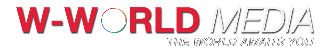
The new identity builds on W-World Media’s established visual language, refining its form, balance, and intent. The circular emblem, a symbol of the company’s global outlook, has been redesigned for greater precision, cleaner geometry, and a unified editorial axis that integrates the symbol and wordmark into a cohesive whole.
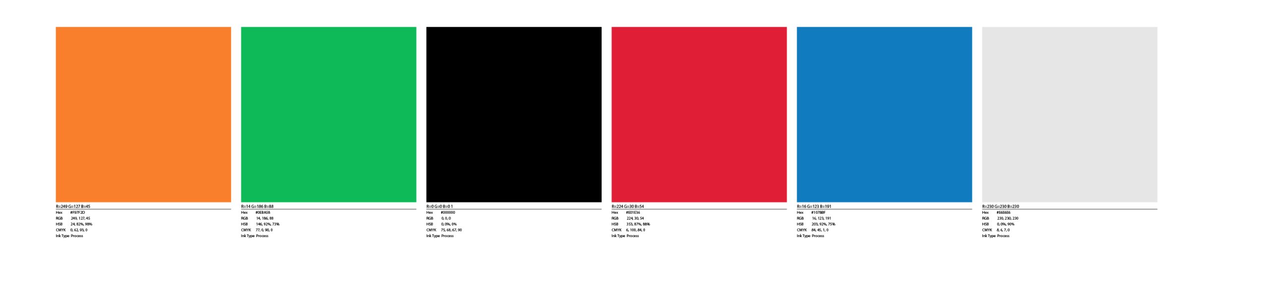
The design now incorporates a modern serif typeface that complements the brand’s dynamic aesthetic. A vibrant four-colour palette, inspired by natural elements, has been selected to reflect the brand’s diversity and adaptability. Additionally, a modular grid system has been implemented to ensure consistency across various platforms and media.
“Our goal was evolution, not reinvention,” said Eric Boland Zaharia, Founder and Editor. “The new logo respects where W-World Media came from, while better reflecting who we are today, a modern, independent media organization operating in a complex global landscape.”
Built on Origin
The foundation of W-World Media traces back to 2009, when the concept that would later become the company first emerged as Welcome to Your World — an idea formed during early studies in business and media.
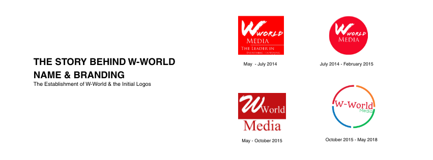
That origin continues to live on today. The “W” in W-World remains a direct reference to those early beginnings, representing openness, perspective, and the belief that media should reflect the world it serves.
A Living Identity
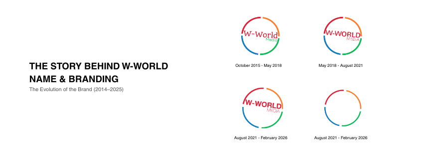
First introduced in 2015, the W-World identity has never been static. It has been:
- Introduced in 2015
- Updated in 2018
- Refined in 2021
- Aligned for 2026
Each iteration has focused on clarity, structure, and longevity — ensuring the brand evolves without losing its core meaning.
At the center of the identity is the four-quarters circle, a symbol representing:
- The four corners of the Earth
- Global perspective and reach
- The foundational pillars of the W-World ecosystem:
- Advertising, News, Publishing, and Film
Independent yet connected, each element stands on its own while contributing to a unified whole.
Design Rationale
- A refined circular form symbolizes the interconnected nature of global news and media.
- A forward-leaning editorial axis aligns the icon and wordmark, conveying clarity, confidence, and momentum.
- A consistent four-colour palette represents diverse perspectives, regions, and voices.
- Cleaner line work and spacing are designed for digital-first publishing, broadcast use, and long-term scalability. The logo’s adaptability across various sizes and platforms ensures that it maintains clarity and recognizability whether viewed on a large billboard or a mobile screen. This flexibility is achieved through responsive design guidelines that allow the logo to adjust its details and proportions, preserving its core essence without losing impact across media.
The update aims to improve legibility across platforms, ensure consistency in digital and print environments, and provide a flexible foundation for future brand applications. By refining the design and optimizing user interfaces, these changes make W-World Media’s content easier to find and interact with, allowing readers to access information more efficiently. Additionally, this refresh is expected to enhance audience engagement through a more accessible, modern presentation and to boost brand recognition by firmly establishing W-World Media’s identity as a leader in the global media landscape.
For our business partners, these improvements translate into enhanced co-branding opportunities, facilitating stronger collaborations that can increase visibility and audience reach. The new branding elements are designed to seamlessly integrate with partner assets, enabling mutual growth and more effective market penetration.
Soft Launch to Official Adoption
W-World Media began introducing the new logo in late 2025 on select social media posts to assess visibility, audience response, and real-world performance. The feedback from our audiences was insightful, showing high engagement and positive reactions to the refreshed design. Many appreciated the modern look and the cohesive representation of the brand’s global vision. One specific feedback we incorporated was a suggestion to adjust colour contrast for better readability on smaller screens, which led to a refinement of the colour scheme to enhance digital versatility.
Additionally, several users highlighted a preference for slightly bolder text, prompting changes to the logo’s typography to increase clarity. These insights guided final refinements before the official rollout. We invite our audience to continue sharing their thoughts and experiences with the new branding. By encouraging ongoing feedback, we aim to make our community feel valued and involved in W-World Media’s evolution, ensuring our brand develops in line with the expectations and preferences of those we serve.
With this announcement, the refreshed identity will be fully adopted across:
- Corporate communications and business documents
- Digital platforms and social channels
- Marketing materials and press assets
Legacy logos will be retired from active use and preserved as part of W-World Media’s historical brand archive. While these logos will not be featured in new content, they will remain visible in archived materials and older content produced prior to the rebranding. This ensures a respectful nod to our history and allows continued access to past creative work. Legacy logos may be referenced in historical context documents or in symbolic uses such as anniversary promotions, provided their usage is clearly distinguished from the current brand identity. Guidelines for the appropriate referencing of legacy logos will be available to designers and partners to maintain brand consistency.

Detailed brand guidelines and updated assets will be accessible to all partners through our dedicated partner portal beginning February 2026. This timely access helps ensure that all collaborative materials align correctly with the new brand identity, supporting effective implementation and maximizing cohesion across platforms.
Designed to Evolve
The refined identity emphasizes restraint, adaptability, and consistency across platforms. Rather than following trends, the design system was developed to scale — supporting digital, broadcast, print, and emerging media formats over the long term.
“We designed this identity to grow with the company,” said Boland Zaharia. “It’s built for longevity, not cycles.”
Looking Ahead
The refreshed branding demonstrates W-World Media’s ongoing commitment to independent journalism, thoughtful analysis, and a global perspective as the organization enters 2026. W-World’s website, w-worldmedia.com, will also get a refresh with the new branding, including updated navigation for easier access to content, enhanced mobile responsiveness, and an improved user interface for a more engaging user experience. The new features aim to streamline access to the latest news and insights. The website will be released by the end of March. During this transition period, users may experience brief interruptions or changes in access. We encourage users to check our social media channels for updates and plan accordingly to avoid inconvenience.
Additional updates to corporate materials and platforms will be introduced throughout the first quarter of the year. Partners should begin updating their materials starting in early February 2026, with a target completion by the end of March 2026. This timeline aims to facilitate a smooth transition and ensure all communications are aligned with the new brand identity.
About W-World Media
Founded in 2014, W-World Media is a multi-platform media company operating across advertising, news, publishing, and film. The company builds and supports brands and platforms designed to inform, connect, and engage audiences globally.
For more information, visit w-worldmedia.com.
Media Contact:
W-World Media
📧 press@w-worldmedia.com
🌐 www.w-worldmedia.com